Why Manufacturing Dashboards Fail (And How WireFlow Solves It)
Most factory software is built by people who have never spent a day on a plant floor. The result is dashboards full of information—and empty of action.
Walk into almost any factory running modern manufacturing software and you'll see a familiar scene.
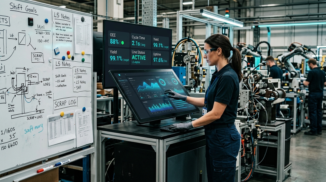
A large monitor displays dozens of charts, gauges, percentages, trend lines, and KPIs. Then, a few meters away, you'll find a whiteboard.
And that whiteboard often contains the five numbers operators actually care about.
The dashboard exists for reporting. The whiteboard exists for operations.
The Dashboard Paradox
Most manufacturing software is designed around a simple assumption: More visibility leads to better decisions. In practice, the opposite often happens.
Every additional chart competes for attention. Every extra metric increases cognitive load. Every dashboard screen becomes harder to scan under pressure.
When something goes wrong on the factory floor, operators don't need more information. They need clarity.
The 3 Questions Every Manager Must Answer in Seconds:
If the dashboard cannot answer those questions within a few seconds, it has failed its primary purpose.
The WireFlow Audit
While studying manufacturing operations in Aurangabad's wire industry, we noticed a pattern. Several factories were running sophisticated ERP and reporting systems with screens showing 40+ KPIs at once.
On paper, the dashboards looked impressive. In reality, operators rarely used them. Instead, teams maintained handwritten whiteboards beside the terminals containing:
Production Count
Machine Status
Downtime Info
Quality Issues
Shift Targets
Five numbers. No charts. No filters. No drill-down menus. Just the information required to make decisions.
That was the moment we realized the problem wasn't missing data. It was too much data.
The Signal-to-Noise Principle
WireFlow was built around a simple constraint:
“Everything visible on the primary screen must be actionable within five minutes.”
If a metric cannot trigger an action, it does not belong on the main dashboard. Historical trends and detailed analytics still exist, but they don't compete for attention during live operations.
Designing for Plant Managers, Not Analysts
Many industrial dashboards are designed as if every user is a data analyst. Most users are not. They're supervisors managing multiple machines, operators responding to alarms, and production managers balancing targets.
A good manufacturing dashboard should be understandable from several feet away. A great manufacturing dashboard should communicate system status before the user consciously starts reading.
The Real Job of a Dashboard
Most dashboards are designed to display data. We believe dashboards should support decisions. Those are very different goals.
That's why every screen in WireFlow starts with the same question: What action should happen next?
In manufacturing, the most important information is rarely the most detailed. It's the information that helps someone act before a problem becomes a loss.
Building FuelShield: Lessons from 100+ Hours in Truck Yards
Real-world IoT is 10% code and 90% dealing with vibration, diesel fumes, power fluctuations, lost GSM signals, and humans determined to bypass your system.
Building Student Projects at Scale: How We Deliver in 48 Hours
The systems, templates, and internal workflows that allow Ugam Campus to consistently deliver professional-grade engineering projects in days instead of weeks.